This is part of a series of articles designed to help you craft powerful and engaging protest signs.
Our last article focused on how color can affect your sign's legibility and emotional impact. Here are some additional considerations to keep in mind to maximize the visual impact of your sign.
Make Text Easy to Read
Make sure your letters big and bold to make them easy to read by passersby. Signs that are easier to read also photograph better, which increases the likelihood of your sign being shared on social media or included in media coverage.
According to graphic design firm VisualPro, 1-inch letters can be read from 10-feet away; 2-inch letters, 20 feet away; and 3-inch letters, 30 feet away. Make your letters at least 2-3 inches tall so drivers passing by can easily read your sign.
For longer messages, break up the text into two sizes. Pick the larger size for your main idea; use the smaller point for supporting text.
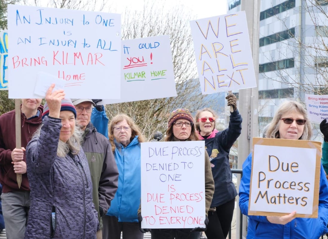
Avoid thin or overly ornate fonts, which can be hard to read from a distance. In the photo below, the sign on the right that reads, "Due Process Matters" is much easier to read than the ones on the left. That is because the letters are thicker and there is greater contrast between the letters and the background of the sign.
Don't forget about kerning, or the spacing between letters. Cramming letters together to fit a small space will make your sign less legible. Try also to make the space between letters consistent. Letters that are irregularly spaced are distracting visually.

Next: Lettering & Art
Further Reading
- Sophie Bushwick, "How to Make the Best Protest Sign", Popular Science, April 10, 2017.
- Justin Caffier, "How to Make a Protest Sign That Isn't Garbage", Vice, February 22, 2017.
- Brett Torrey Haynes, "Sign Letter Height Visibility 101", Visual Pro, October 30, 2020.
- Tula Jeng, "March On: How to Make A Protest Sign", Whorange, February 16, 2017.
- Brooke Tully, "How to Design an Impactful Protest Sign", Brooke's 2 Cents, February 25, 2017.
- "The Dos and Don'ts of Signage Contrast for Readability and Impact", Tupp Signs, February 10, 2025.


