Now you are ready to design your sign. Here are some considerations to keep in mind as you pick a color scheme for your sign.
Readability Is Key
Limit your color scheme to 2-3 colors to ensure that the letters on your sign pop. More colors on a sign might look attractive, but will slow down readers of your sign.
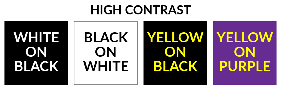
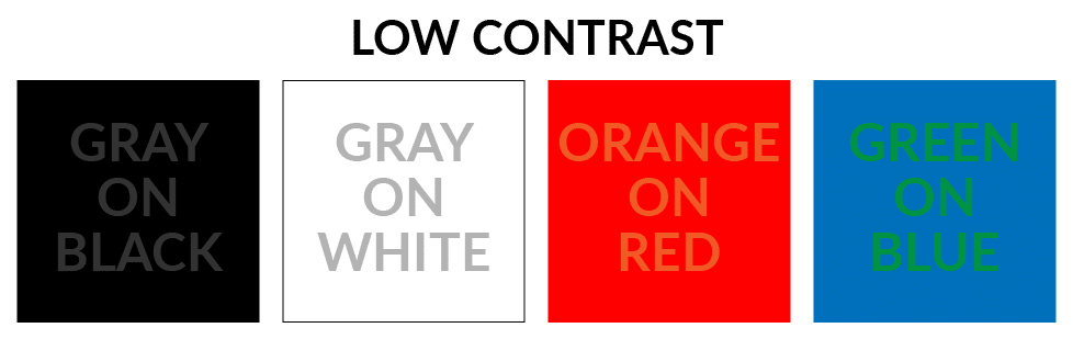
Picking a background color other than white can make your sign standout in a crowd. But be sure that your text is in a color that highly contrasts with the background. Notice how much easier the text is to read in the first image below than the second.
Because colors convey emotions, they can be incredibly useful in conveying a political idea or sentiment. For more background, check out this article by Giorgia Lombardo that examines the use of color in international protest movements in modern history.
Visibility Brigade Signs: Organizers recommend using white letters at least 2-feet tall placed on a black background for creating signs that will hang on an overpass. These signs need to be easily read by drivers passing by at least 55-mph. For more guidance on creating signs for Visibility Brigade Actions, see this guide. Before starting a new local Visibility Brigade, check in with organizers of the North Shore Visibility Brigade who can be reached at northshorevisibilitybrigade@gmail.com.
A coalition of Salem-based organizations has launched the People's Pantry, a mutual aid drive that will run throughout this week and culminate in a Community Speak Out on Saturday.
Once you have nailed down your goals, target audience and message, you are ready to draft the text for your sign. Here are some linguistic considerations to keep in mind.
Below are tropes often seen at anti-Trump protests that we encourage you to avoid because they inadvertently reinforce harmful and demeaning stereotypes. These phrases are often used on signs for
Earlier this month State House committees decided the fate of most bills introduced this year. Yet this info is still impossibly hard to find on the State House website.